A content network consists of an analysis of related clusters of information. Social media platforms that enable the sharing of contents align with research into crowd-sourcing and self-organizing behaviors, where individuals working often in isolation or in small groups share contents that benefit people on the whole. One of the most popular digital content sharing sites is Google’s YouTube, where people may share videos of themselves.
An extraction of a video network is based on the metadata used to label the video contents, and this extraction will result in a related tags crawl.
Cat Videos
A popular meme involves videos of cats and their antics. A search of cat videos on YouTube surface two talking cats, skydiving cats (filmed in front of a green screen), grumpy cats, cats v. dogs, and other themes. This huge amount of human attention to cats has led to the phenomena of “catvertising” (using cats in word-of-mouth advertising). In celebration of this theme, this blog entry will focus on a crawl of “cat” on YouTube. (Also, “cat” is pretty disambiguated.)
To start the data extraction of related “cat” videos from YouTube using NodeXL, please start the NodeXL Excel Template. Click on the NodeXL tab to access the add-in’s ribbon. Go to “Import” and select “From YouTube Video Network” from that dropdown menu.

Setting Data Extraction Parameters
A window titled “Import from YouTube Video Network” will open.

Replace the placeholder “NodeXL” text with the selected search term. Below, in terms of edges (links), select from
Pair of videos that have the same category
Pair of videos commented on by the same user (slower)
Pair of videos responded to with another video by the same user (slower)
Any one, two or three of these elements may be checked. The top level just focuses on videos in the same grouping. The latter two add in social elements—of user commenting and of conversations held via video. For this crawl, all three will be checked for as many interrelationships as possible.
Finally, there is a choice to limit the number of found videos. For this crawl, the box will be unchecked for an unlimited crawl.
The completed window should appear as follows.
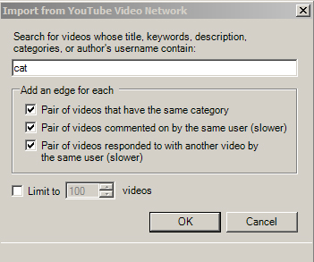
Then, just click “OK.”
The YouTube API does not generally pause crawls of their data. Users of NodeXL may follow the progress of the data extraction. One limitation is that YouTube outputs alphanumeric codes to stand in for the various videos and accounts, so the data that is extracted may be used to create network graphs, but the workbooks themselves are not particularly informative.
Populating the Excel Workbook with Data
When the crawl is complete, the “Text Wrapping” window appears. Click “Yes” for a speedier import.
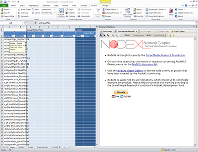
Save the workbook to protect against data loss. In this case, “catvideosonYouTubeunlimited” will do.
Data Post-Processing
To process the raw data into a graph, in the NodeXL tab, go to “Graph Metrics.” Click “Select All” and then click on the “Calculate Metrics” button. The Graph Metrics table looks like the following.

This table found 485 vertices (cat videos) connected by 34,501 unique edges—so a high number of people have interacted around these videos. The geodesic distance of this network (its diameter) is 5; the longest path between the two furthest videos is a path of 5 hops or jumps, with 3 vertices in between. The average geodesic distance is 2.24, which suggests some closeness in content type (relatedness between the contents).
Another step, addressed earlier, is to group the vertices. Go to the NodeXL tab to access the add-in’s ribbon. Click on the Groups dropdown menu, and “Group by Cluster.” For this video network, 11 clusters were found.
Graph Visualizations
Video content networks tend to be fairly sparse (compared to microblogging networks) in part because of the costs of production.
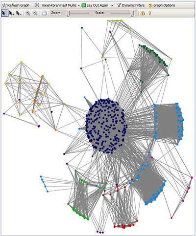
A Harel-Koren Fast Multiscale version of this content network follows below. It shows a main central cluster of videos that are highly interrelated and then some other clusters of videos that are on the periphery. This also shows some “pendant” videos that are loosely connected to the content network by one link (edge).
Another visualization of this same data follows, using the Fruchterman-Reingold force-based layout algorithm. This layout approach strives to make the relationships clearer by creating a degree of repulsion between the vertices or nodes, so that they may be easier to see. This visualization shows not only pendant nodes but even one isolate video which is not connected content-wise to the other videos and which has not received comments or reply videos. An “isolate” node has no actual connectors to the network but is a part anyway (maybe because of the metadata label). It is common practice to conduct multiple visualizations of data because the different visualizations highlight different relationships and information.

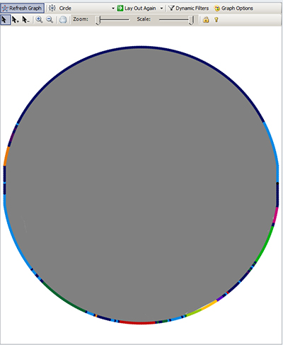
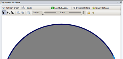
Finally, a ring lattice or circle emphasizes the deep connectivity. Remember that the 11 clusters (and individual nodes) are highly connected with some 34,000 edges. The different vertices are reflected on the edges of the circle, and the connections are indicated by the gray ties in the middle of the circle.
Graph Options
To increase accessibility, the various vertices or nodes are not only indicated by color but also by shape. Also, there are adjustments on the graph pane to enable different depictions of the vertices and edges. In the graph pane at the top right, go to Graph Options.
A “Graph Options” table will pop up. There are adjustments to control for various visuals of the Edges, Vertices, and other elements, for a customized look-and-feel.
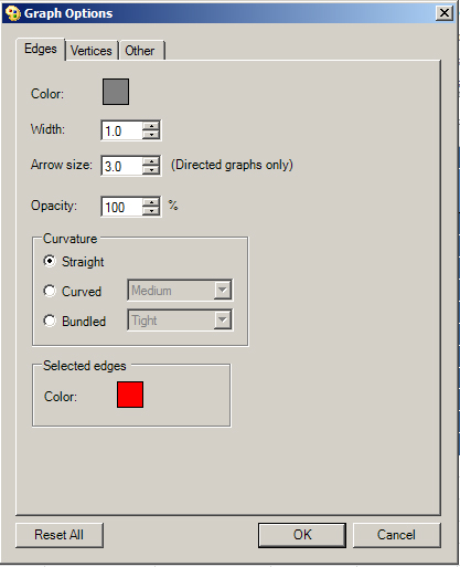
Once changes are made, and the user clicks “OK,” the graph will automatically be re-drawn. If the changes are unsatisfactory, a user may return to Graph Options and click “Reset All” at the bottom left to return to default settings. (It is important to ensure that the graph visualization of the data does not somehow misrepresent the core information. As has been shown in some of these entries, the various algorithms highlight certain aspects of the data while downplaying others.)
Save your Excel workbook.
Final Note: NodeXL is a free and open-source tool that is available from Microsoft’s CodePlex site (which is a space for project hosting for open-source software), and it is sponsored by the Social Media Research Foundation.