(SoftChalk LessonBuilder 6 is a commercial authoring tool.)
Many types of relational and statistical information are expressed using visual images. SoftChalk LessonBuilder 6 has a new type of activity that can express chart information creatively. The two available shapes of the charts are circles and pyramids. Both types of forms will be described here.
The following is a simplified version of Maslow’s Hierarchy of Needs.

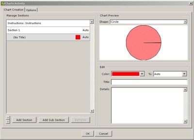
To begin, go to Insert in the Menu Bar, then Activity, and go to Charts. The Charts Activity window will open.
First, we will define the first pre-made section. At the bottom right of this window, we can define the color, the title, and the textual details of this section. For this example, we’ll just use Wikipedia statistics about Kansas State University’s academic staff, undergraduates, and graduate students (1,305; 18,778; and 4,366 respectively, from Fall 2010). (Note: The more correct statistics are available at the Enrollment Statistics link from K-State’s Registrar’s Office. For Spring 2011, as of the 20th day of the term, there are 21,140 students, including undergraduate, graduate, and veterinary medicine students.)
We will use the default red color and just input the label, a brief text, and the correct 5 percent slice for Academic Staff.
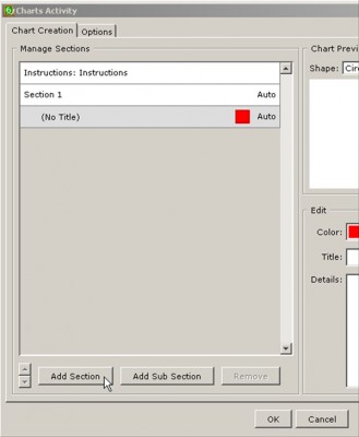
We will now add another section. Click the Add Section button at the bottom left.
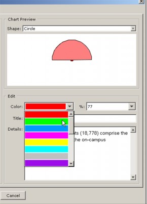
For this, we will choose another color using the drop-down menu.
Finally, we are going to add the third slice. Again, click the Add Section button. Use the drop-down menu to indicate the percentage of the slice. This third slice refers to graduate students, and they come in at 18 percent.
Click OK once the information has been input. Save the file without any spaces in the name. We will call it KStateOnCampusPopulationChart. Now, you are ready to preview this pie chart.
Go to the Menu Bar and click Preview. Click the sections of the shape to the right for more information. This pie chart is interactive and reflects the slices based on actual size.
To experience what the pyramid structure looks like, we’ll use a simple version of Maslow’s Hierarchy of Needs. The basic concept is that once lower-level foundational needs are met, then people may reach for higher levels of needs. Instead of defining a percentage size, each level is treated the same, so the size setting was left at Auto. The system builds from the top of the pyramid down to the bottom. To experience this, see the link below.
The pyramid chart activity allows for a more engaging delivery of simple information.
This information comes from the Wikipedia entry (which is released through a Creative Commons license) on Maslow’s hierarchy of needs.


