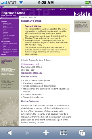
With the increasing popularity of Internet-enabled phones (specifically Wi-Fi-enabled phones like the Apple iPhone), it is advisable that web developers test their webpages on phones to see how they will be displayed to a user on a phone. One of the main issues with mobile phones, of course, is that the screen is much smaller than a typical desktop monitor or laptop.
To remedy this problem, it is fairly simple to create a mobile-optimized version of a website and present the content in a more legible format. Recently, the Registrar’s Office put into production a mobile-optimized (specifically iPhone/iPod touch) version of their website.
The mobile site is accessed by using an iPhone or iPod touch to browse to any of the Registrar’s Office pages, found at www.k-state.edu/registrar. In the near future, other devices will be included.
A couple of before/after screenshots are included below in case you don’t have the capabilities to view the site with a mobile phone.


If you are interested in learning more about developing webpages specifically for the iPhone/iPod touch, Apple has some great references in their Developer Library for Mobile Safari. For more information or advice, contact me directly ( astroot@k-state.edu, 785-532-0976).